The Mark
Built To Last.
An architectural monogram of interlocking columns — a brandmark engineered to feel as solid as the institution it represents.

Beachler Family Trust is a multi-generational wealth and investment practice. They needed a mark that signaled permanence, discretion, and quiet authority — something that would read as confidently etched into a building as it would printed on a business card.
The solution centers on an architectural brandmark: a set of interlocking vertical columns that read at once as pillars, ledger lines, and the letter "B" — a structure built to last. It's paired with a refined high-contrast serif wordmark and a spaced "FAMILY TRUST" lockup.
The full identity spans primary, secondary, and stacked lockups, a standalone monogram for tight spaces, a navy-and-periwinkle palette, and a Proxima Nova type system — all documented in a complete brand style guide.
An architectural monogram of interlocking columns — a brandmark engineered to feel as solid as the institution it represents.
A flexible suite that holds up everywhere — the full horizontal lockup where space allows, a stacked version for square formats, and the standalone monogram for favicons, stamps, and the smallest applications.
 Primary Lockup
 Reversed / On Navy
 Monogram
A deep, trustworthy navy anchors the system, lifted by a periwinkle blue that keeps it modern rather than stuffy — with a soft grey for backgrounds and rest.
A single, versatile family does the work — Black for headlines, Semibold for subheads, and the regular weight for body copy. Clean, geometric, and trustworthy.
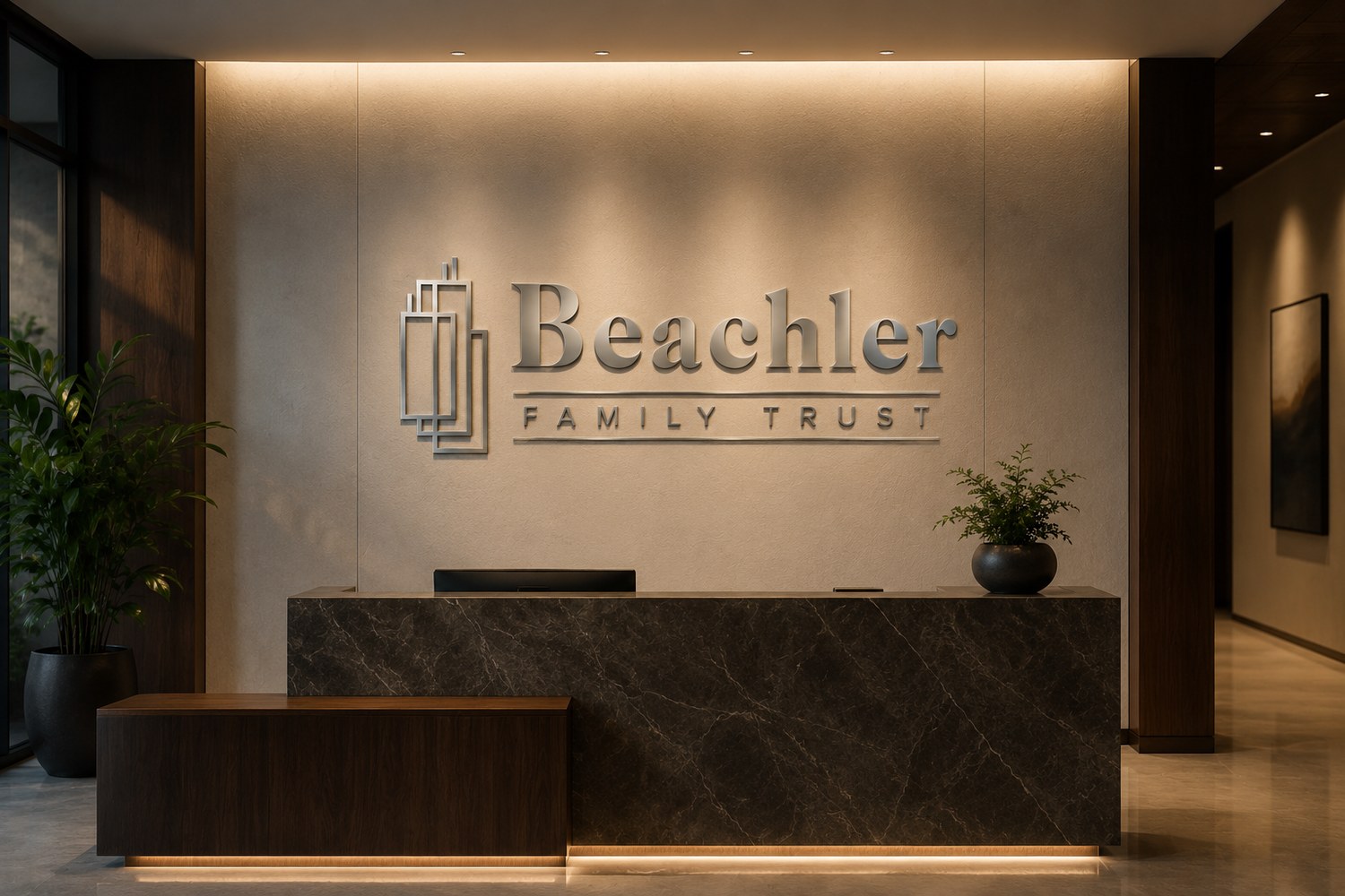
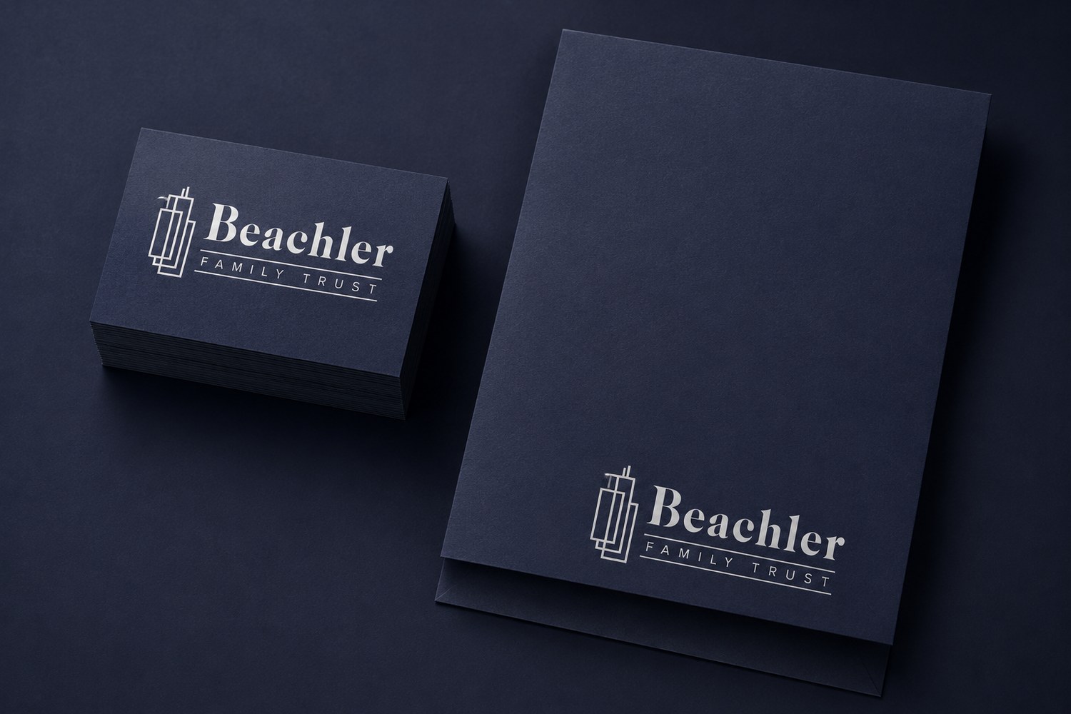
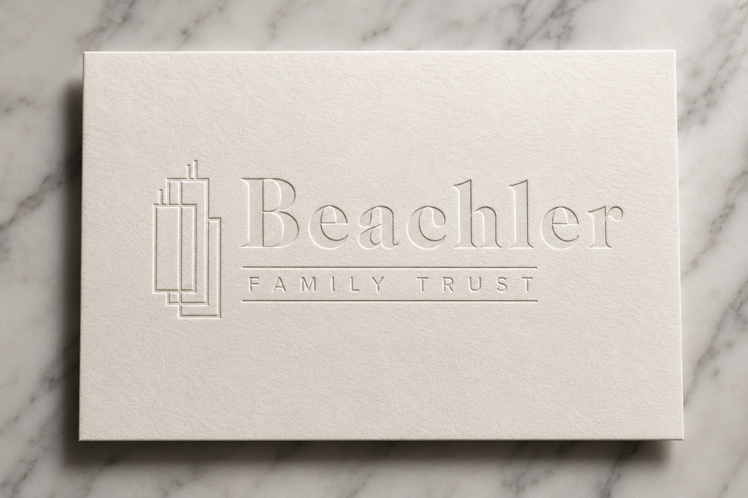
From reception signage to stationery — the identity carried across the touchpoints a trust client actually sees.
The monogram flexes into the small stuff — app icons, profile avatars, and a subtle repeating pattern for linings and backgrounds.

A complete, future-proof identity — delivered as a full vector logo suite and brand style guide, ready for print, signage, and screen.
Start a Project →